
BrowTricks design system
Browtricks is a PMU (permanent makeup) delivery site and mobile where clients can review and opt for services, schedule apppintments and buy products offered by the business owner.

Challenge
The app had a cluttered interface and inconsistent icons everywhere, making it difficult for users to navigate and find essential features. The core problems we needed to solve were:
•Clarify the visual language
•Have a consistent design language
•Create a working design system
Results
We designed a visual language that resonated with the customers. Designer and developer communication improved.
The improved components resulted in a 35% faster development cycles and new user adoption rates.
35%
Improved development cycles
25%
Increase in user adoption

Process
Clarifying audience and role: I conducted user interviews with the SME (business owner) to understand the target audience. The target audience for PMU is women from 25–55 who have the money or are having trouble with their brows. This includes older women with alopecia or who have just gone through chemo.
Aligning our visual language to a vision
Based on the research findings, we created three themes for the visual language:
Empowerment and Royalty
Enhance natural beauty to look and feel their beast the app's navigation and content, prioritizing features and information according to user needs.
Luxury
Subtle patterns or textures that evoke a sense of luxury
Long-lasting
PMU is long-lasting, so want to convey a sense of timelessness and develop trust
Creating moodboards along with the client
I had gathered various elements that represent the three tents for the vision identified above. Also identified textures and color schemes that match the tenets.
Soft blush and peach
To introduce softness and femininity and to create a harmonious balance with the other colors.
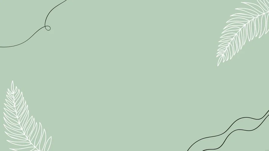
Sage green
For accentuating elements like icons or secondary call-to-action buttons to add an organic feel to the palette, symbolizing growth and natural beauty.

Aligning on the typefaces, colors and naming conventions
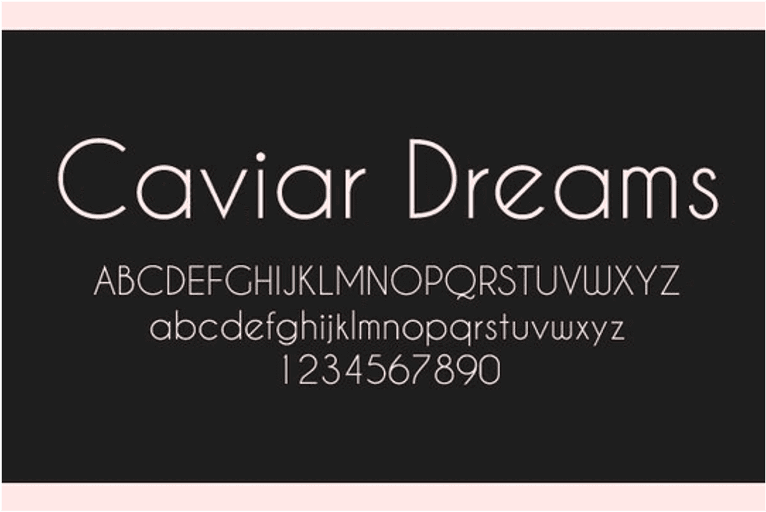
For the main typeface, we wanted something subtle but the client wanted something very expressive. So we went with Caviar dreams. For the body text, we used Roboto as it was calibrated for ease of comprehension on both web and mobile.
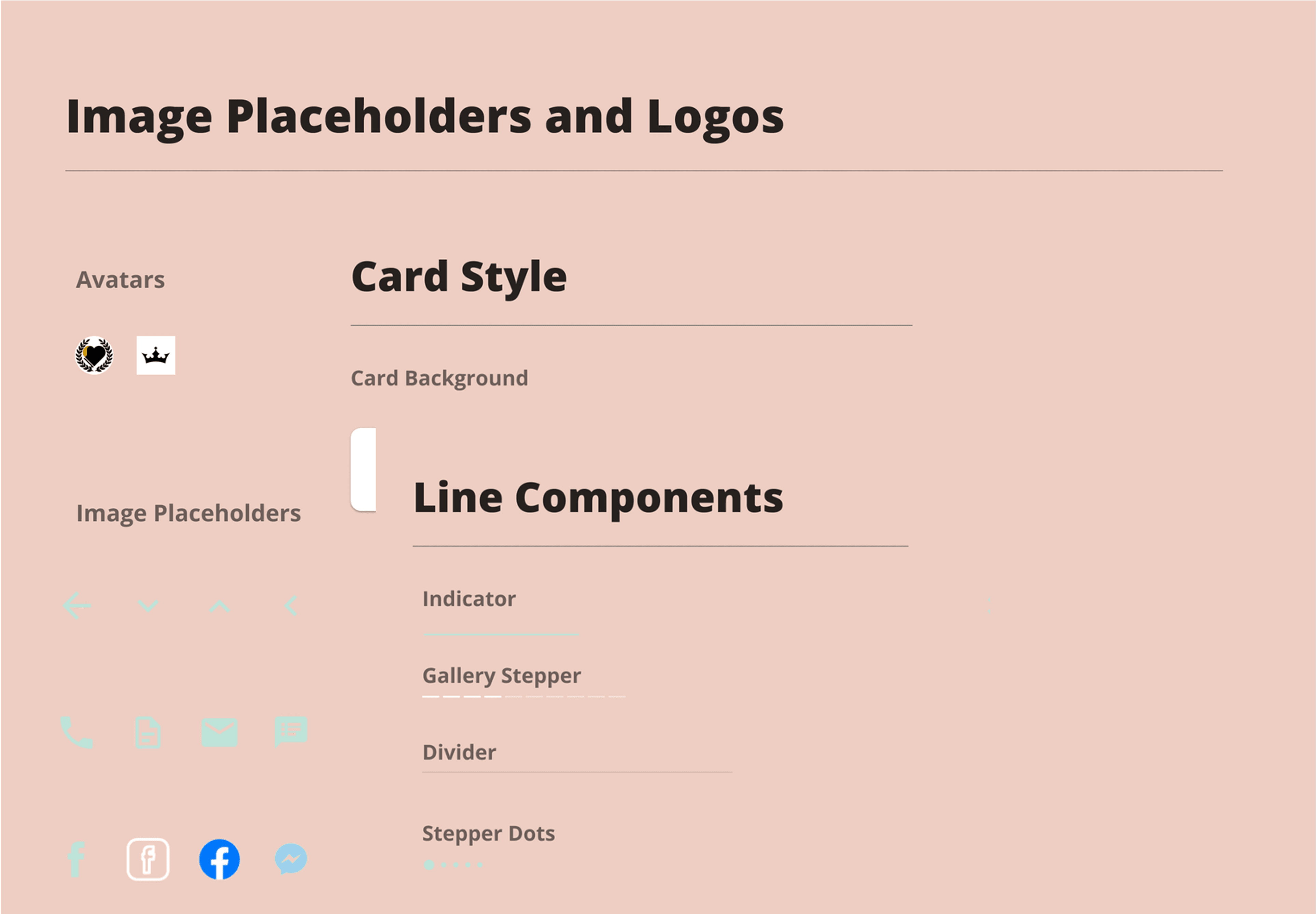
Building out the design system
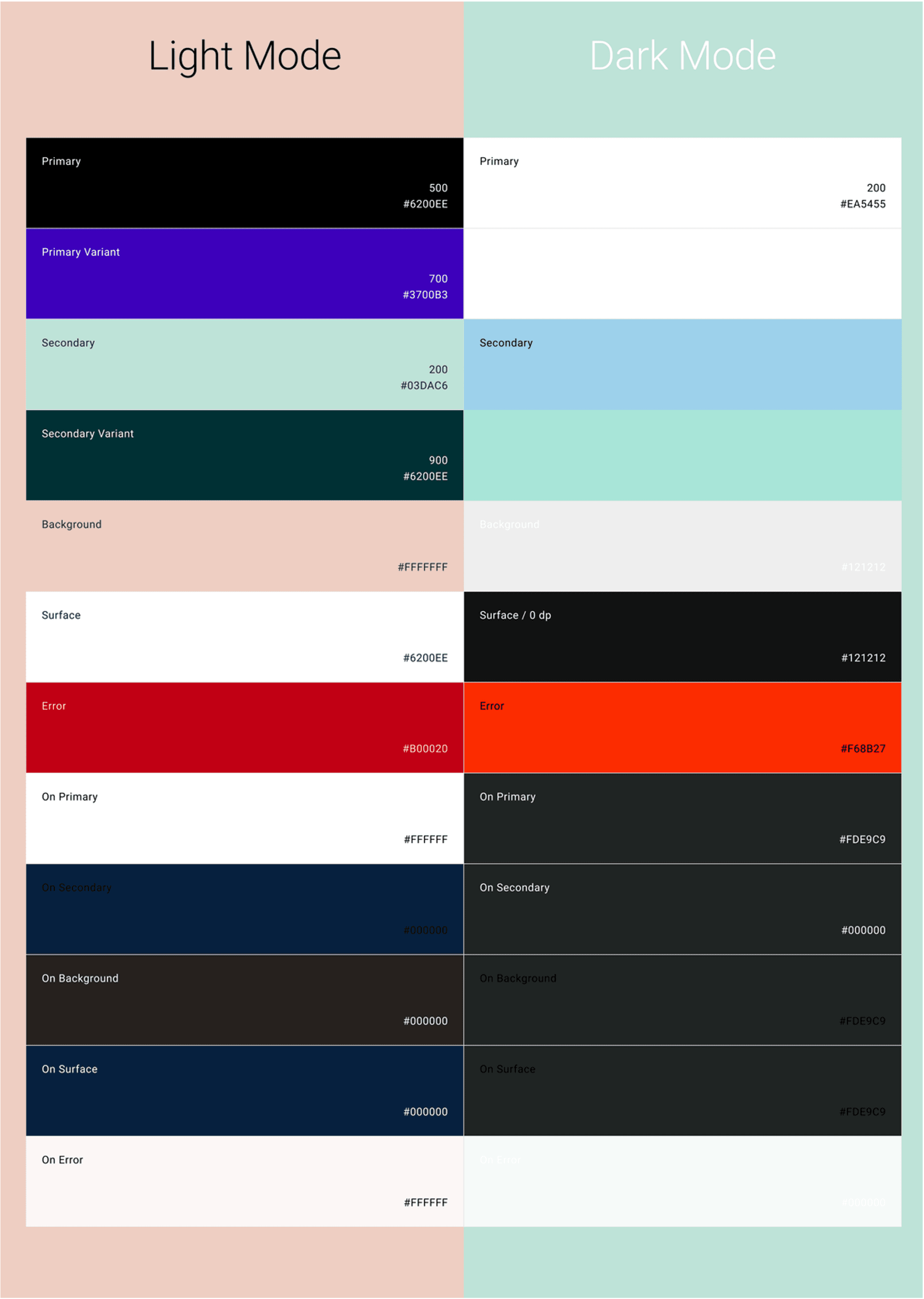
It was then time to build them out on Figma. We had to have both light and dark mode, so relied on Blush and black for the light mode and sage green for the dark mode.
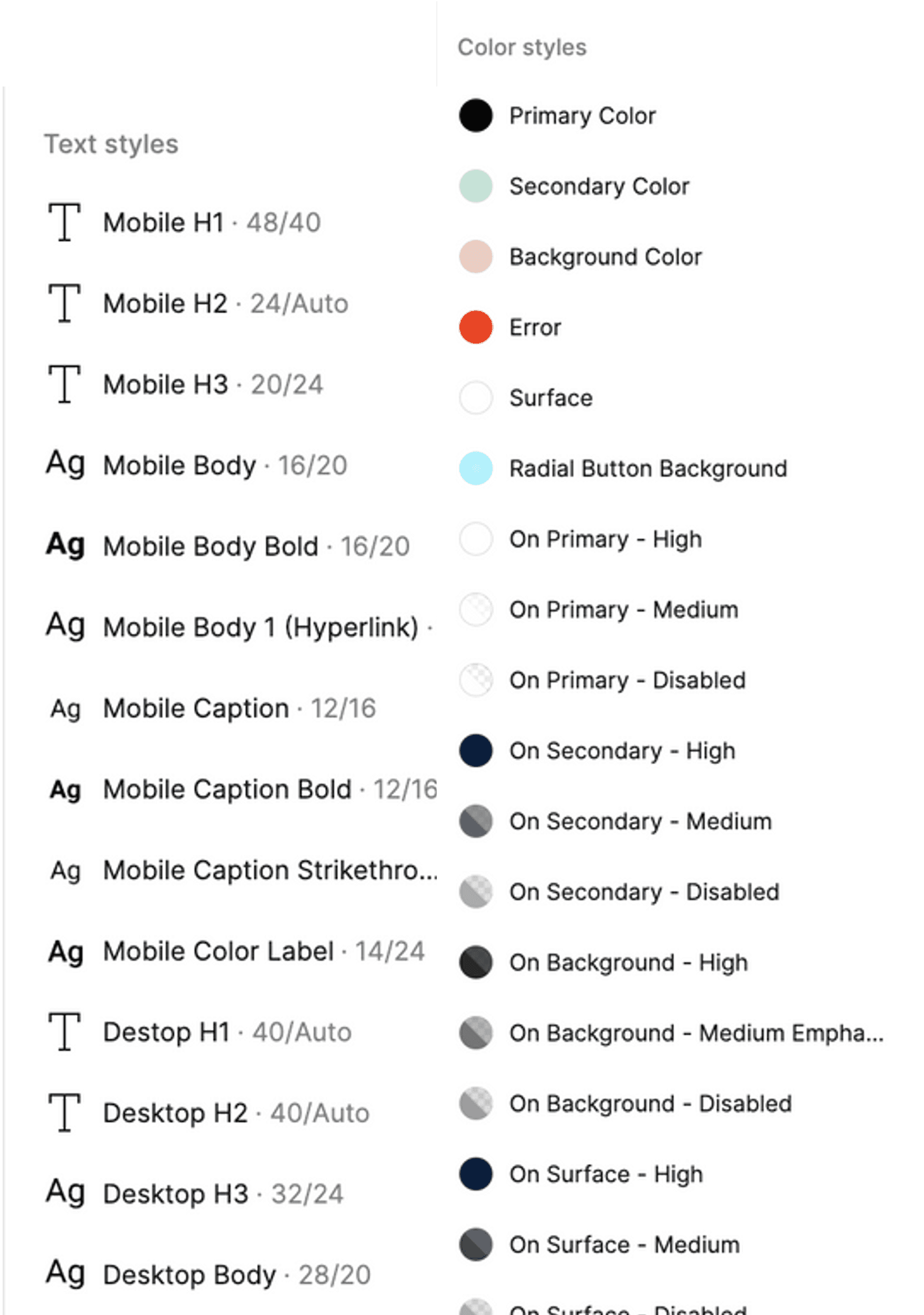
Documentation
I shared documentation of text and color styles to collaborate with engineers early and often, We used interactive prototyping in Figma to persuade the client as to why it was a good idea to keep textures minimal for interfaces.
Conclusion
Built and established a functional DS. Upon tracking progress of how the system was used with other designers and engineers, it improved shipping speed and we launched earlier than promised. The client also had renewed positive impressions on the brand as a result of this effort.